BRANDING
BRANDING
BRANDING
BRANDING
BRANDING
Sweet Spot
Sweet Spot
Sweet Spot
Sweet Spot
Sweet Spot
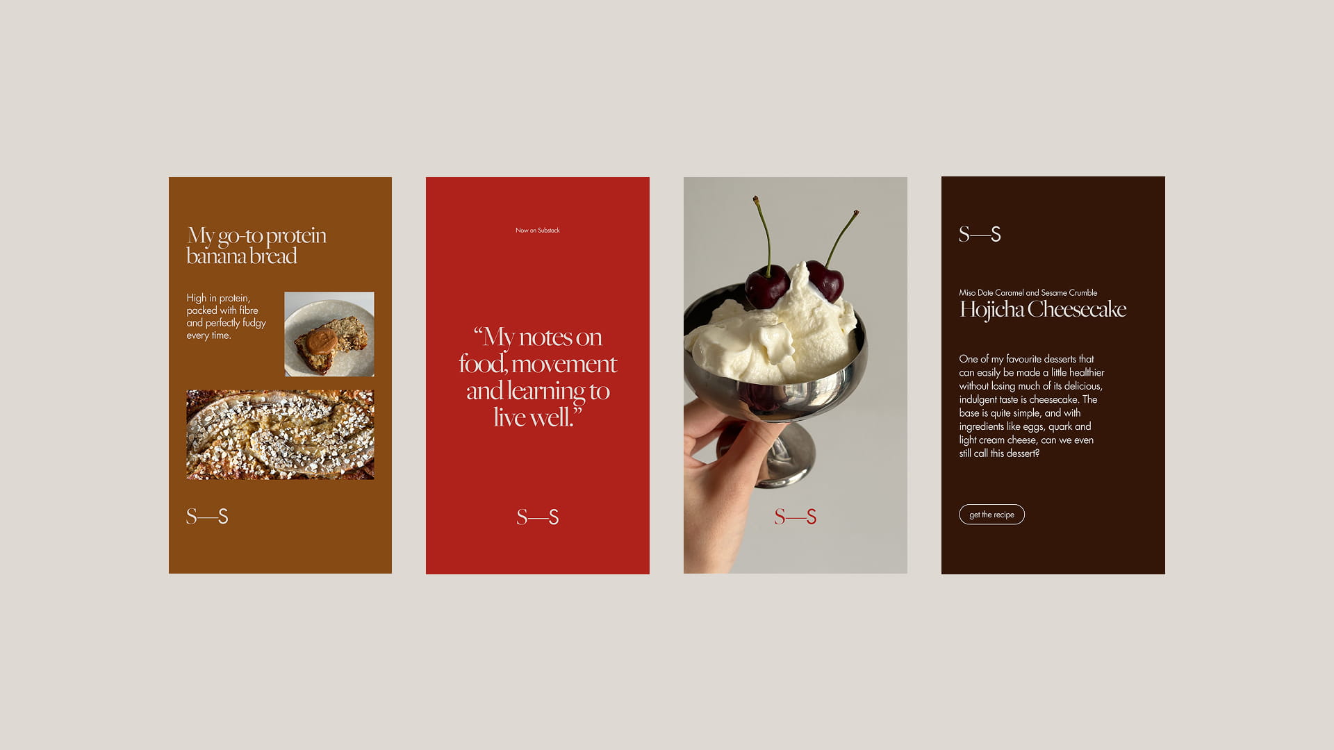
Sweet Spot is my personal Substack exploring food, movement and wellness. I created a visual identity that feels warm, balanced and closely connected to both the content and my existing personal brand.
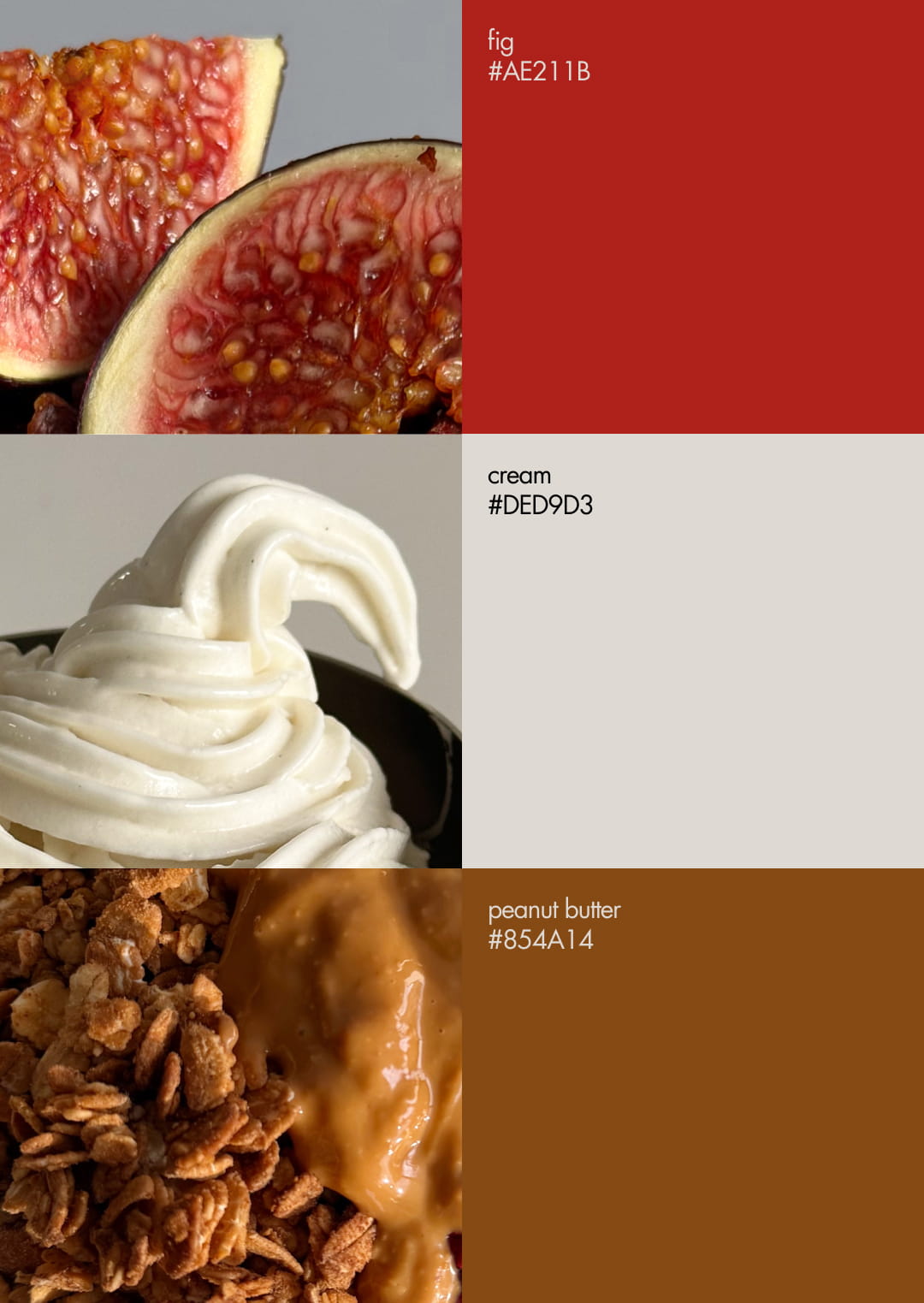
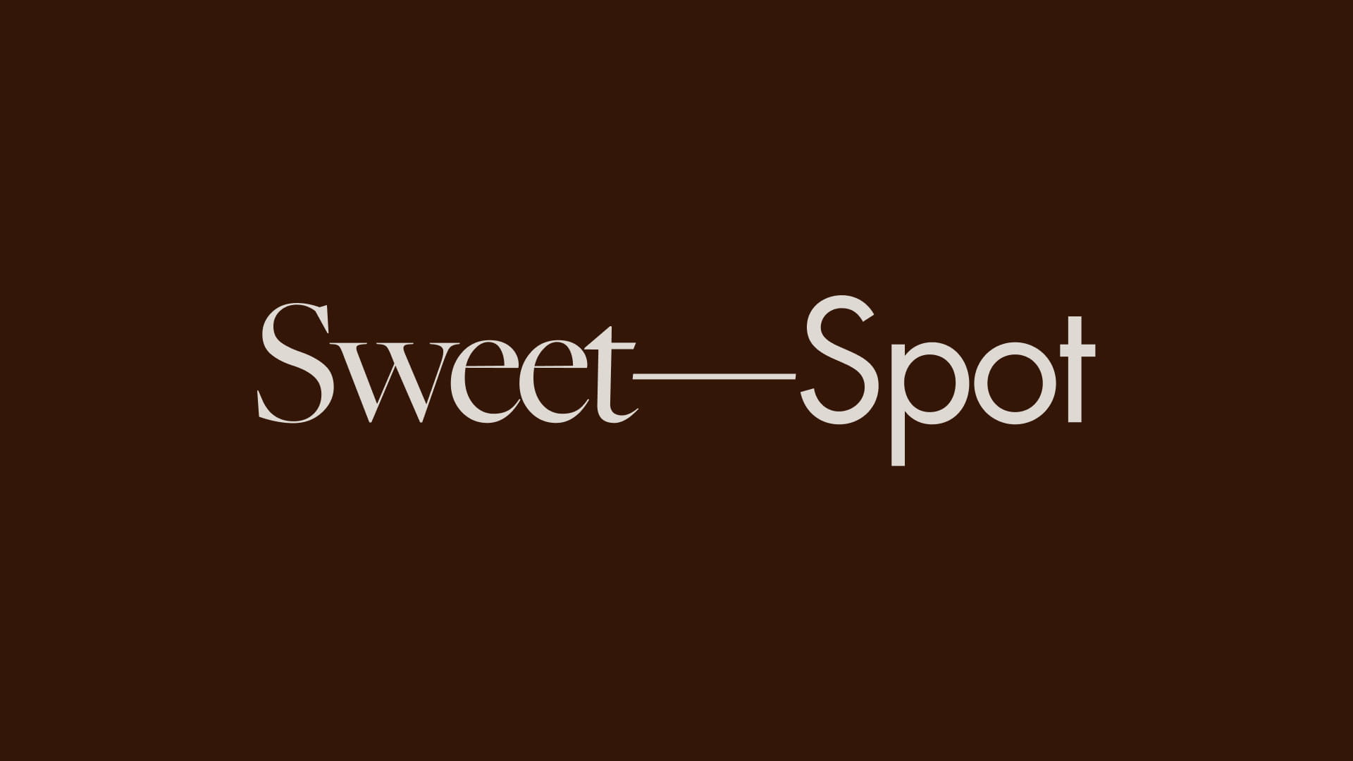
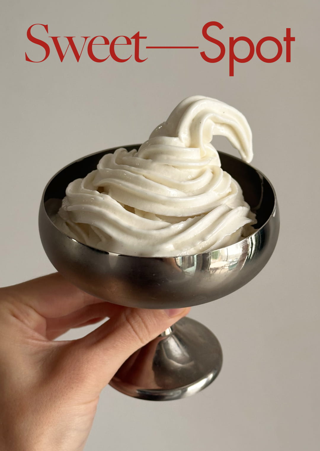
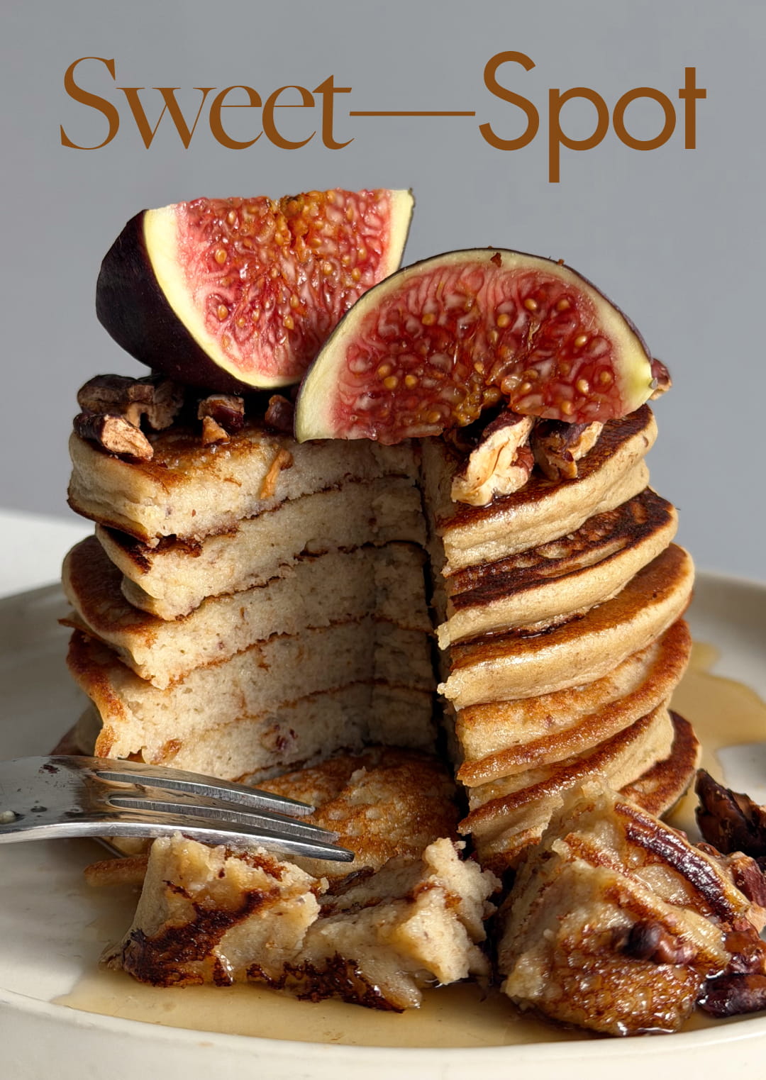
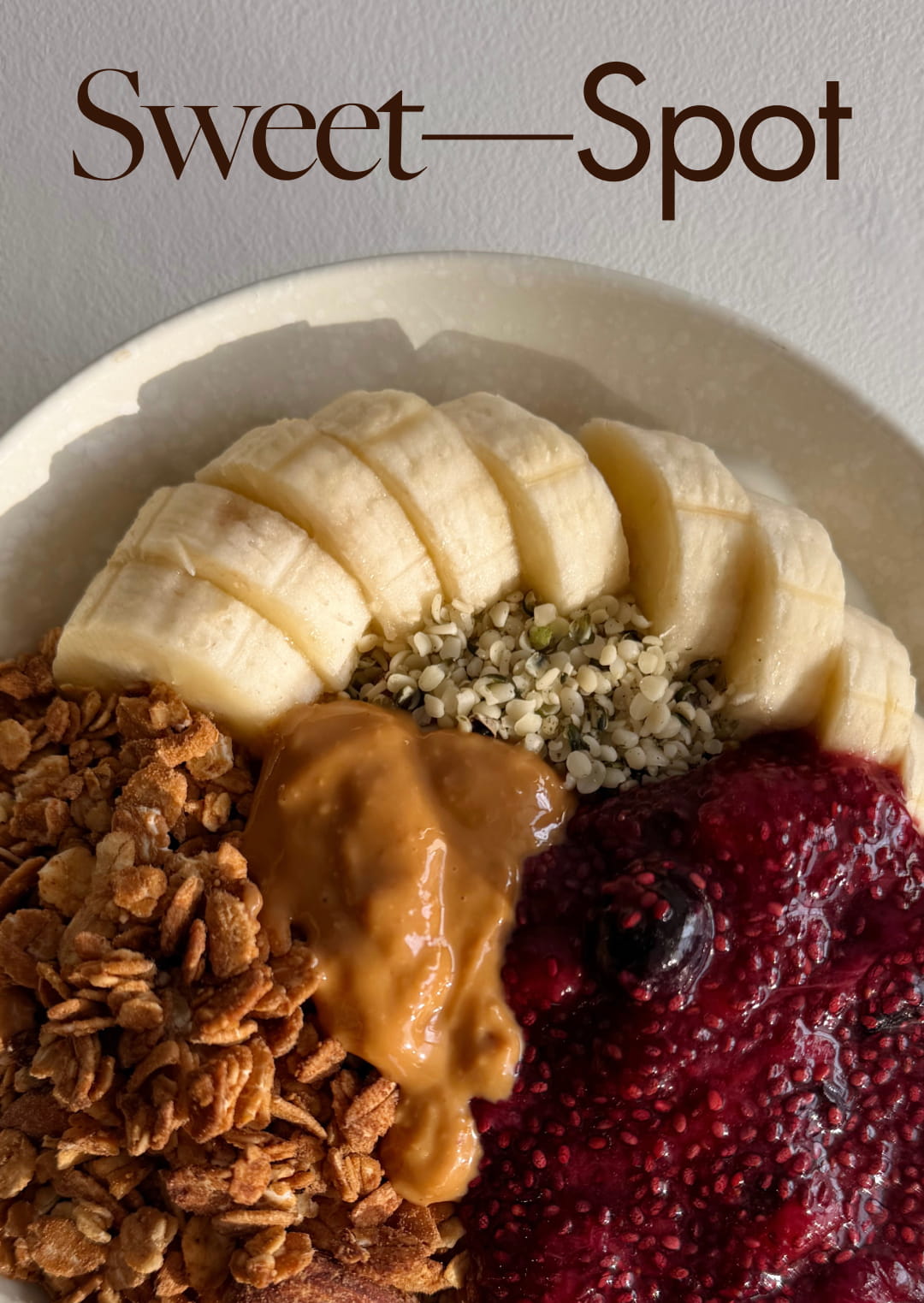
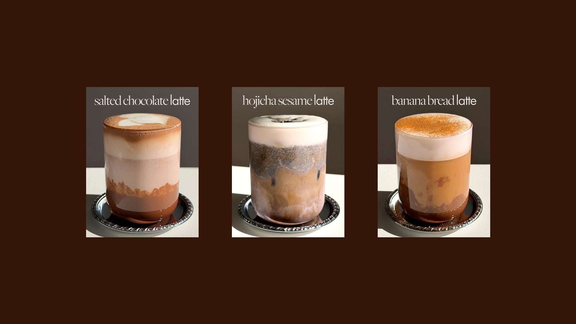
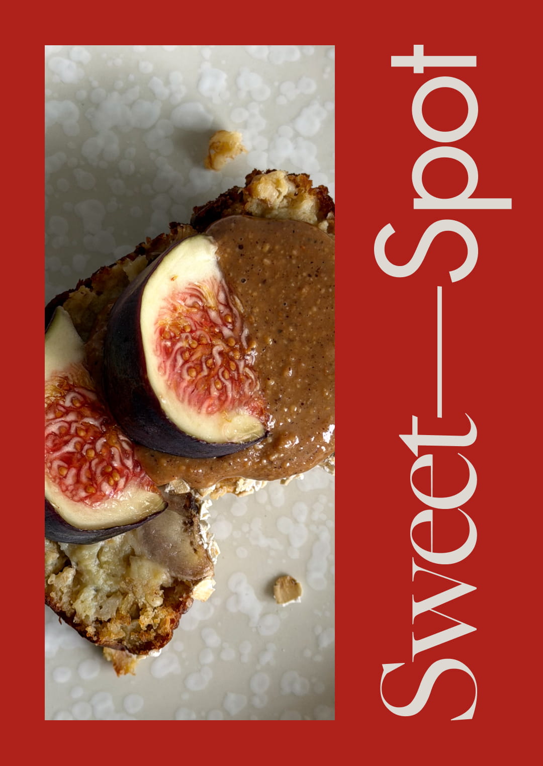
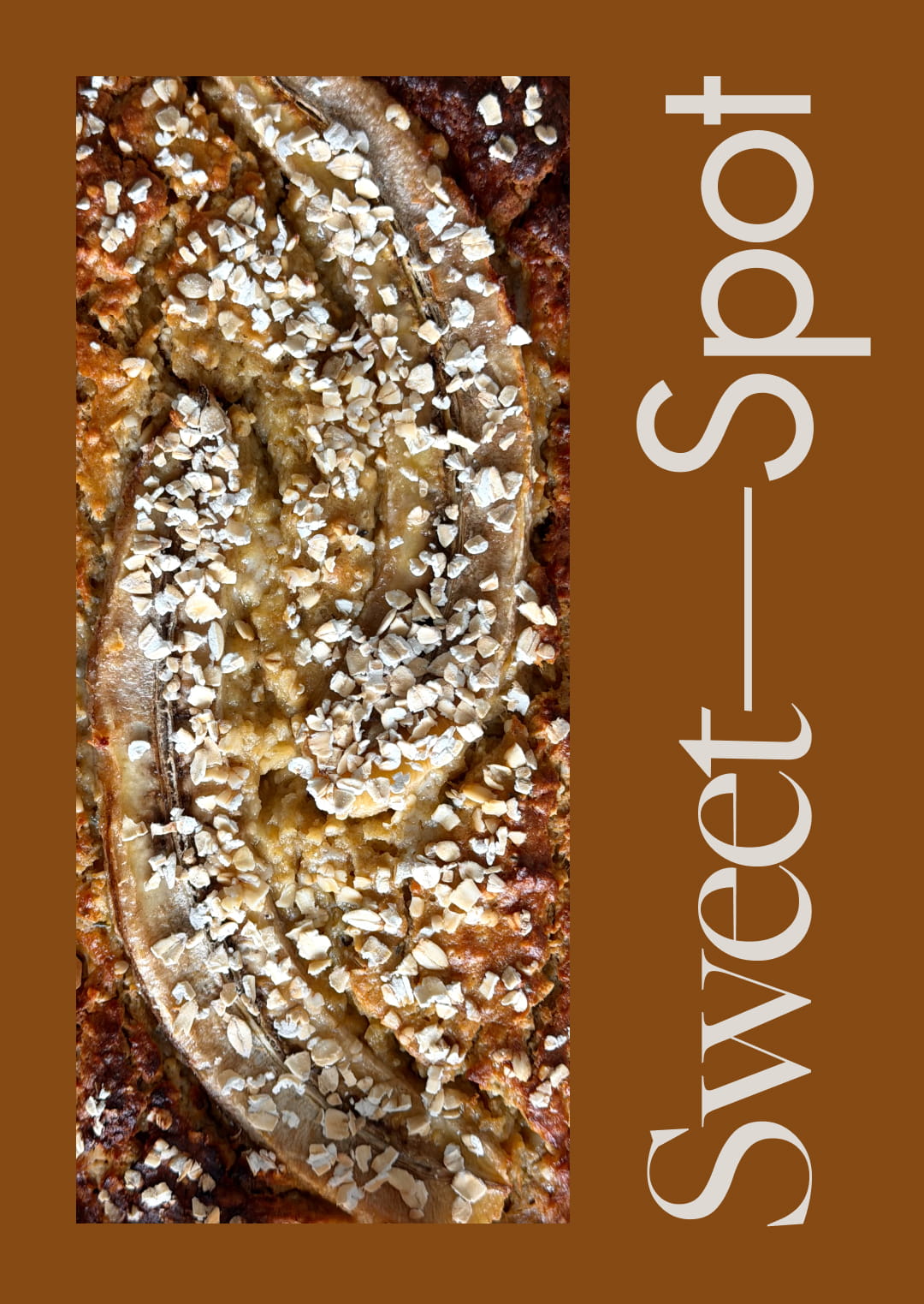
The neutral colour palette is inspired by ingredients I often use and naturally gravitate towards: peanut butter, cream, fig and dark chocolate. To create continuity with my personal identity, I carried over the same typefaces and reimagined the dash from my KAT—BRG wordmark for Sweet—Spot. Here, the line becomes a symbol of balance, reflecting the idea of finding that sweet spot in living well.
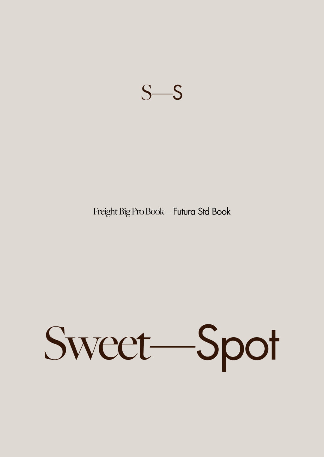
The wordmark pairs Freight, an elegant serif, with Futura, a clean geometric sans serif. The contrast between the two creates a sense of balance between softness and structure, further reinforcing the meaning at the heart of Sweet Spot.
Sweet Spot is my personal Substack exploring food, movement and wellness. I created a visual identity that feels warm, balanced and closely connected to both the content and my existing personal brand.
The neutral colour palette is inspired by ingredients I often use and naturally gravitate towards: peanut butter, cream, fig and dark chocolate. To create continuity with my personal identity, I carried over the same typefaces and reimagined the dash from my KAT—BRG wordmark for Sweet—Spot. Here, the line becomes a symbol of balance, reflecting the idea of finding that sweet spot in living well.
The wordmark pairs Freight, an elegant serif, with Futura, a clean geometric sans serif. The contrast between the two creates a sense of balance between softness and structure, further reinforcing the meaning at the heart of Sweet Spot.
Sweet Spot is my personal Substack exploring food, movement and wellness. I created a visual identity that feels warm, balanced and closely connected to both the content and my existing personal brand.
The neutral colour palette is inspired by ingredients I often use and naturally gravitate towards: peanut butter, cream, fig and dark chocolate. To create continuity with my personal identity, I carried over the same typefaces and reimagined the dash from my KAT—BRG wordmark for Sweet—Spot. Here, the line becomes a symbol of balance, reflecting the idea of finding that sweet spot in living well.
The wordmark pairs Freight, an elegant serif, with Futura, a clean geometric sans serif. The contrast between the two creates a sense of balance between softness and structure, further reinforcing the meaning at the heart of Sweet Spot.
Sweet Spot is my personal Substack exploring food, movement and wellness. I created a visual identity that feels warm, balanced and closely connected to both the content and my existing personal brand.
The neutral colour palette is inspired by ingredients I often use and naturally gravitate towards: peanut butter, cream, fig and dark chocolate. To create continuity with my personal identity, I carried over the same typefaces and reimagined the dash from my KAT—BRG wordmark for Sweet—Spot. Here, the line becomes a symbol of balance, reflecting the idea of finding that sweet spot in living well.
The wordmark pairs Freight, an elegant serif, with Futura, a clean geometric sans serif. The contrast between the two creates a sense of balance between softness and structure, further reinforcing the meaning at the heart of Sweet Spot.
Sweet Spot is my personal Substack exploring food, movement and wellness. I created a visual identity that feels warm, balanced and closely connected to both the content and my existing personal brand.
The neutral colour palette is inspired by ingredients I often use and naturally gravitate towards: peanut butter, cream, fig and dark chocolate. To create continuity with my personal identity, I carried over the same typefaces and reimagined the dash from my KAT—BRG wordmark for Sweet—Spot. Here, the line becomes a symbol of balance, reflecting the idea of finding that sweet spot in living well.
The wordmark pairs Freight, an elegant serif, with Futura, a clean geometric sans serif. The contrast between the two creates a sense of balance between softness and structure, further reinforcing the meaning at the heart of Sweet Spot.
personal project
art direction, design & creative concept
2026
© 2026 Katharina Berghofer / Impressum / legal notice